Published on Friday, 29 Jan, 2016
Undertaking website reviews
 Sally Lait
Very often at the start of digital projects where there is already a website or app in place, some kind of an expert usability audit is performed. This is usually done as part of UX work, intending to provide an objective, independent view of the current site – from the client’s perspective it’s really useful for them to gain an outside view on what works well and what could be better.
Findings will often help to inform the next lines of enquiry for the project, and to provide an initial view of key features or user goals that may need to be focused on. Even if the site is to be completely replaced, learnings from the existing setup can be invaluable in planning and prioritising for the future. We can also do reviews periodically, to help us keep on top of improvements.
I often do reviews like these as part of my work, and have done them for a range of reasons – to help start-ups sense check their progress, to help companies better understand what they should be focused on, and to help make a case for improving internal workflows and processes.
Reviews can take several forms, from more formal and rigid heuristic assessments or particular task analysis, through to informal usage of the site and capturing areas that are good or bad. They can be done in conjunction with thinking about personas and the expectations and needs of people who are using the website, and may use data analysis to identify problem areas and frustrations. Very often these can work well alongside throwing real users into the mix, to get their views alongside the expert’s opinion.
At the end of the process we’re usually left with a set of areas, hopefully prioritised, that could be better from a user’s perspective. However, very often this takes a very black and white view of the world, and may not always get to the real heart of the issues involved. Perhaps a website should have extended content, but the organisation isn’t well-staffed enough to manage this. Maybe a clunky checkout process is down to wider issues with the accountancy and payment systems being used by the business behind the scenes. Broadening our view with website reviews can help to get better answers around our “why?“s, and to make more robust, well-considered recommendations for the future.
As such, whenever I need to assess a website I typically do more than a simple usability review. I always try to look at a number of facets in order to gain a well-rounded view of the situation, so that I can hopefully give better, more useful feedback. I’ll take you through an overview of my approach now.
Areas to consider
When I set out to undertake a review, although I typically follow a loose general structure there’s always some individual consideration around each case. Everyone’s different, and everyone will have slightly different needs. As such, the following areas are my go-tos, but you may find that you’ll need to tweak them for different situations.
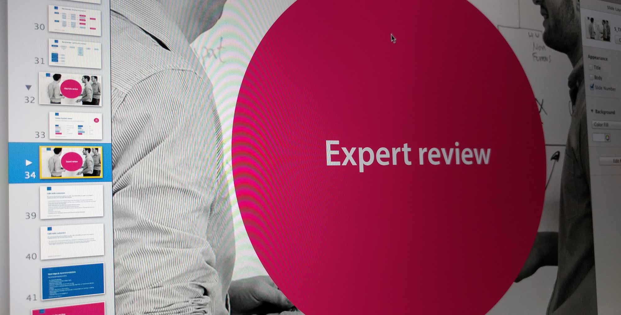
Expert review
Let’s start with the expert review aspect, seeing as we were just discussing that. There are lots of references out there with views on how to approach this, but my personal take is a balance between focusing on key tasks to frame the review, and general expert insight. Over the years I have created my own prompts for things to look for (that’s a post in itself…), but I use these as a guide rather than as an absolute.
Sometimes you may be wanting something a bit more definitive, such as if you’re reviewing sites for comparison purposes, or if you need a way to quantifiably put benchmarks down. In these instance, a more typical heuristic review may be a better approach, where your trained expert eye is marking everything against set criteria.
When it comes to reviews, no matter the approach, I always try to test on as many devices as possible – what works well on one may not work well on another. With devices, ideally try to go beyond mere screen sizes, and explore things like text-only versions, using different input methods like touch and voice, and variable connection speeds.
Here are some links that could be of use:
- Userfocus – 247 web usability guidelines
- Open Device Labs
- Modern.ie screenshots tool
- Google Mobile Friendly check
Throughout your review you may find some legitimate bugs along the way – things that aren’t improvements or informing strategy, but which simply need fixing. Perhaps discuss this in advance – if it’s appropriate within your remit, the client may appreciate you feeding these back as actionable tasks through the channel that they use, however it may be that many are already known, and that part of your work is actually as an outside, independent ‘backer-upper’ on this front.
Analytics and data analysis
At the start, I mentioned that you may want to consider doing your review in conjunction with other activities, such as observing users. Regardless of whether or not you’re able to do this, having a look at any existing analytics can help to draw your attention to potential problem areas, or to back up what you’ve already found.
Depending on the tool used and its implementation, you may be able to see information around where and how people arrive, what they do next (and next…), where people are leaving, and whether they come back. You may be able to get the search terms that people find the site with in order to assess whether the current content is useful, but you can also use on-site search tracking to learn more – perhaps they want to search by product codes but can’t, or want to find all ‘blue’ items but there is no filter.
Whilst this kind of information can be great to feed back as part of the review, it can also help to inform future analytics strategy and implementation.
This could again be a post in its own right (or you could speak to someone like analytics consultant Darren Ware), but some good questions to ask at this point include:
- Is everything set up to its full potential within the analytics tool (from a business perspective, or to give us future insight that we need)?
- What can we learn about the people that are using the site?
- Who isn’t using the site? Why might this be?
- If there are goals set up, what can conversions (or lack of) tell us?
- Can we find any errors and their root cause?
- What are people trying to do (even if they can’t), and what can this tell us? (Look at their journeys, searches, etc)
- Could we be better supporting people in other channels – e.g. do our products appear in Google Shopping listings (etc)?
Code review
Whilst it’s not always a requirement in terms of suggesting improvements and better experiences, having a view of the structure and quality of the underlying code can give you a sense of how realistic (or painful) actually implementing your recommendations may be. Hopefully, you’ll be working with someone who will give you access to both the front- and back-end code, and you can have a manual poke around, or you may even be given access to tools through which peer reviews happen. When you do your investigating, try to keep in mind that the goal is not to determine whether or not the developers are terrible at refactoring; instead try to keep in mind the main question of what are the opportunities to make these digital experiences better for our users and the business?
This is the first area where I often use checkers, or automated review tools. Some example of these are:
- W3C HTML validator
- W3C CSS validator
- JSLint and JSHint
- JS source complexity analysis
- Modern.ie site scan
- Not a tool, but if nothing else you always have access to good ol’ manual view source
Now, as soon as you mention validators, someone will usually pop up saying that they’re irrelevant. You’re probably thinking it right now, aren’t you?
I disagree. I think that validators are a great indicator of wider issues. Let’s look at a quick example: in November 2015 the Ryanair website launched a redesign; one which was jumped on immediately by people within the web community with regards to its performance. As I said at the time, I always apply some subjectivity with automated checks, but 2100 CSS errors and 53 accessibility issues, at launch, were a huge red flag to me that something was going wrong.
@jaffathecake I always apply a bit of subjectiveness with checks, but these to me are red flags of wider issues… pic.twitter.com/yjSswv07RF
— Sally Lait (@sallylait) November 6, 2015
Almost all of the HTML fails in this case were down to using AngularJS, with custom attributes not being recognised. Your thoughts on Angular aside, there’s more to these kinds of checks than just finger pointing. They can instead be a good indicator of maintainability and scalability issues, whether teams perhaps need a greater awareness of wider issues like accessibility, and how to build better testing (both people and tool-led) into processes.
Accessibility
Anyone who has ever experienced a formal audit to gain AA or AAA compliance will likely remember that there is a degree of human judgement involved, however this is an area where it’s also useful for me to run sites through a couple of automated checkers in order to pull up any key issues.
A really important point here is to make sure that you’re reviewing different areas of the site – don’t just plonk the homepage URL into a validator – run areas with forms and more complex functionality through too. Two of my favourites are:
You’re hopefully getting the feeling by now that the checks that I do aren’t in isolation, and that there are many crossovers. Accessibility isn’t simply about meeting legislation or making sure your site works for screen readers – passing these checks is another good sign that your code is semantic, that it is well-written, and that it will be more maintainable (as well as more accessible). It may also be a sign that your CMS is outputting poor code, or doesn’t have the capability to easily let users do important things such as add meaningful alt tags – we’ll come on to looking at these systems in a bit.
Performance
Last one, before we hit peak-broken-record-itis – performance is another great red flag for wider issues, and can also be looked at quickly using some popular checkers. Not only is the performance of websites a key part of the user experience, but it also likely ties into other areas – maybe the code quality isn’t great, a responsive implementation could be improved, or perhaps the hosting or integrations need to be looked at. Maybe you’re just loading jQuery five times from different locations (true story).
Over the last couple of years there have been some great resources put out there, and awareness of the importance of performance has skyrocketed. At a basic level, the following may be useful to you:
Assessment of other systems (CMS etc)
Some sites that need reviewing will be very small and standalone, but others may include a content management system (CMS) at a minimum, or may integrate with other internal or external data sources, services, and systems. Unless you’re doing an extremely thorough, end-to-end review you’ll probably not get too deep into these, but there are often key overlaps that can impact on our experiences.
Take for example a beautiful, responsive website that jumps out to a non-responsive third party payment gateway, or that embeds an iframe to house some fiddly controls. These areas may not be directly under your control, but it’s worth having the conversation around whether they could be improved. Where white-labelled products are used, it’s worth checking to see if they support cross-domain tracking, so that you can follow users both on your site and the other products.
Perhaps we’re also suggesting that a certain process is changed, or that we surface different information. Can we find out whether we’re limited by any of these systems, or look at what data is (or isn’t) available to us so that we can start seeing if we can make it happen?
Where a content management system is in place, this is a huge area to look at – content admins are very much ‘users’ too! If you can, try to get a login for a test system so that you can ask yourself some of the following:
- How do the tasks that I’ve uncovered match up to the system that people are having to use?
- Is there anything that should be able to be managed that isn’t?
- Does everything update correctly and as expected?
- How does the system deal with different image sizes?
- Is input validation appropriate/too lax?
- Is the CMS causing any limitations in experience?
Interactions, channels, and processes
Whilst we’re looking at the site from an admin perspective, it’s also worth trying to tie this into speaking to people more widely about their admin processes. This will probably go beyond the scope of a basic review, but identifying poor front-end output can lead to us seeing that a CMS is frustrating, which can in turn lead to working out how better to support team members with their jobs through digitising processes or simply making interfaces more usable.
It’s also not limited to admin tasks – considering the wider channels for communication with customers (how the website relates to social, telephone, email interactions etc.), how digital ties into these, and even what isn’t digitised at the moment can be some great extended transformation discussions to keep tabs on for after the initial review.
How to report back
That feels like a lot, doesn’t it? Now imagine how it’ll feel to be the person receiving the brain dump of all of your findings!
Back at the start of my career when I was working for an agency, we typically would collate any findings into a big old document, and send it over to clients. Big old documents can look impressive to some eyes, but since I’ve been solely responsible for my own delivery of findings I’ve refined how I do this. My top tips are therefore:
1. Deliver/receive your findings in person
Even if the project is done entirely remotely and as a standalone review, I would still highly recommend setting up a conference call, video chat, or ideally a working feedback session. Having some information is good, but being talked through it directly is much, much better. I like to create a simple deck containing the key takeaways, and to talk around this framework.
2. Tell stories
Where possible I like to use some of the key tasks that we identified very early on in order to take my audience through the steps, highlighting key points from each of the above areas along the way. To some people, having a section on ‘accessibility’ may not mean much to them, but showing that key information is being missed because of a poor colour contrast, may.
3. Consider your audience, vary the detail
Similarly, you may be presenting your findings back to an extremely senior audience who only have 10 minutes to hear everything before they need to go and work back to mergers and acquisitions, or you may be presenting to the Head of Technology who wants to step through a performance waterfall chart in detail. Knowing this up-front will help you to tailor your review, and will also likely feed back into the materials you eventually hand over. Don’t waste your time creating a 50 page document that nobody will ever read, unless they do want the detail for reference.
4. Prioritise and recommend
The bit that everyone is usually looking for are the key recommendations – that’s probably why you’ve been brought in. Make sure that these are easy to find, and are compiled somewhere. If you can give people your recommendations, prioritise these, and even a suggestion on the level of complexity, this can really help with decision making. Don’t worry about exact estimates – tshirt sizing (Small, Medium, Large) is usually a good enough starting point at this stage. Depending on what you find, prioritisation could be based entirely on your expert view, but it may also be worth running a final workshop to present back and to work through these together.
5. This is not the end!
Throughout the course of your turning over of stones it’s likely that you’ll find things that may need further investigation, more discussion with the business itself, or could benefit from other skill sets taking something on and running with it. This is ok! Reviewing a website (and beyond), shouldn’t be the end of the process, but instead is a great springboard. Hopefully by taking a more broad, well-rounded view of all of the elements, you can feed your findings in to create some meaningful improvements across the whole space you’re looking at.
“I commissioned Sally to do a technology audit and was impressed by her right from the start. She’s an exceptionally clear communicator who was able to ask all the right questions to get to the bottom of the brief. She completed the task ahead of schedule and submitted a report I regularly refer to – four months after the work was done – and which has formed the cornerstone of my technology strategy. I highly recommend Sally and look forward to working with her in the future”Rebecca Evans, Founder at Write Track
Want to do something similar?
If you’d like to find out more about how I could help with a review, or to see more detail around case studies of other projects, please have a look at the site review service page or get in touch. We’d love to hear from you!
Read more from the blog
Back in time:
Choosing the ‘right’ CMS
Forward in time:
Monthly round-up: February 2016
Posted by Sally Lait
Sally is the lead consultant and founder of Records Sound the Same, helping people with digital transformation. She's also a speaker, coder, gamer, author, and jasmine tea fiend.