Published on Thursday, 22 Jun, 2017
Rebranding and rebuilding
 Sally Lait
Earlier this year I wrote about the thought process that had gone into the company rebrand, which came about with the help of the lovely Katherine Cory. After that followed the main slog — translating the direction into something suitable for the web, and getting it built.
Any ground-up rewrite of a digital project can be a challenge, and whilst this iteration of the site is still a work in progress I wanted to document some of the key considerations from the journey so far.
Choosing a content management approach
The choice of technology and site build actually got underway long before Katherine had finished. A lot of the copy was already done, plus the site structure had been defined, so the choice of technology was all about finding something to match.
The previous website content had already been ported once before - from a bespoke platform originally to WordPress. Over the years, the custom WordPress theme had done more and more of the heavy lifting, with almost all of the content for site pages being written directly into the source files (as opposed to using WordPress functionality). Posts were usually written in Markdown in a dedicated writing app and then pasted into the post editor, plus comments were turned off, meaning that there was really very little reason to be using WordPress at all. Unlike most people looking for a content management system, what wasn’t needed was a full-blown CMS and editing interfaces. Instead, it was more a system and framework for creating content that was going to be more appropriate.
I’m well-versed in the complexities of helping others to choose technologies, and felt that it was worth doing the same kind of due diligence for content managing the company site. I wanted to make sure that the technology wasn’t imposing too many overheads, and would be suitable for a good while to come.
My starting point was that I already suspected that a static site generator would probably be the best fit. The benefits of static sites have appealed to me for a long time, and if you’re interested in learning more about the topic in general please get in touch (I’m happy to answer individual questions or write more on this). Phil Hawksworth has also written about and given some excellent talks in this area. In this instance, I didn’t need any kind of GUI (as I was editing code and writing posts directly), and I was interested in the speed, security and simplicity that plain old HTML affords, whilst also having the benefits that generators bring above hand-coding every page.
After researching the latest options and creating a couple of prototypes to get a feel for them (always a good option to use something directly rather than trusting the marketing!), I settled on Hugo. Hugo so far feels a fantastic match for my needs. It’s blazingly fast to compile everything, very logical, and I very rapidly set up a workflow that met exactly what I was after. More crucially, unlike many other options it didn’t require a really context environment setup or a large number of dependencies. I was so impressed and have enjoyed using it so much that I’m now in the process of switching my personal site over too.
Much of the content was to be new, but migration of posts did take a little bit of time to tidy up. The WordPress export didn’t do a great job with things like embedded tweets or videos, but thankfully most other aspects converted quite well.
The other foundation laid was to set up some basic automation, which took the form of Gulp. If you’re not familiar, as they put it:
gulp is a toolkit for automating painful or time-consuming tasks in your development workflow, so you can stop messing around and build something.
It’s all about setting foundations, so that the actual building process can be more efficient, and should involve less human error from doing repetitive tasks manually.
At this point it was on to thinking about what the site should do, and how it should look.
Designing the site
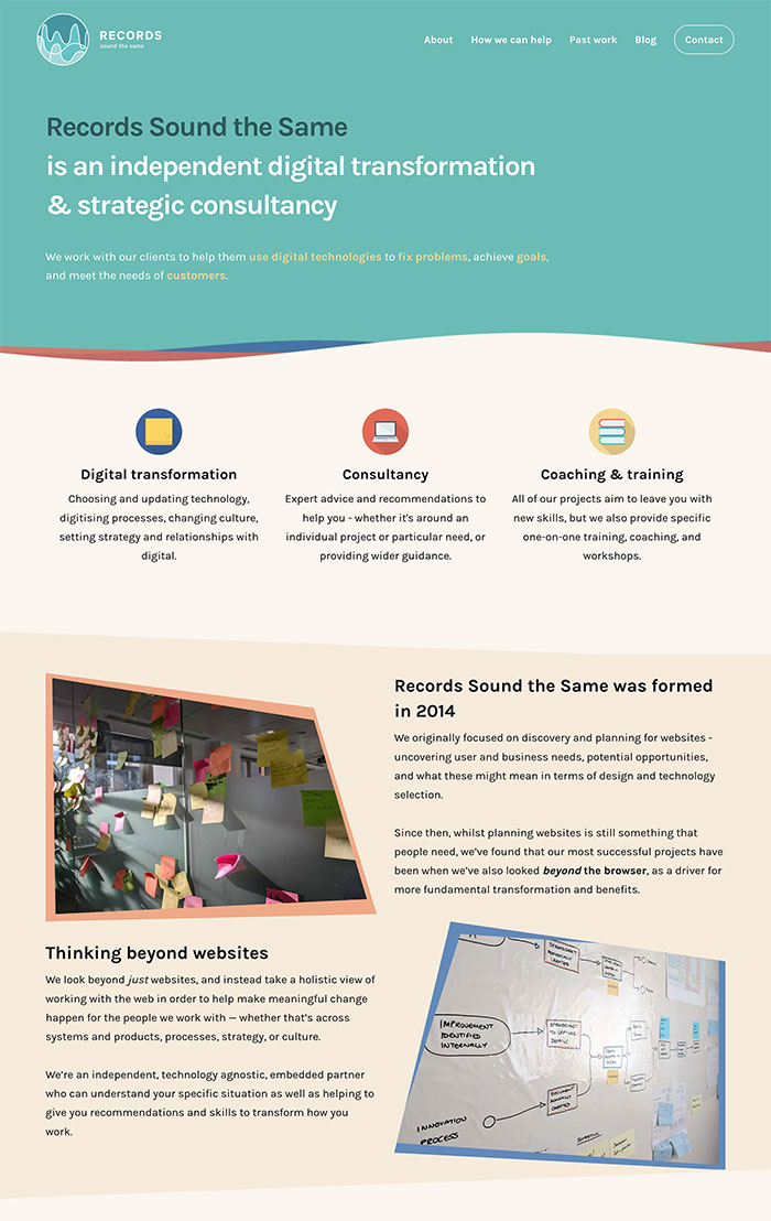
As Katherine had created plenty of assets, including the ability to flex the brand based on the context of usage, there was plenty to play with. We’d discussed the idea of the site being colour and pattern led rather than overly image-based, and there was also the matter of the concept itself – the deliberate irregularity of the logo and changing of context. This, I felt lent itself really well to playing with some less traditional shapes, plus a bit of animation.
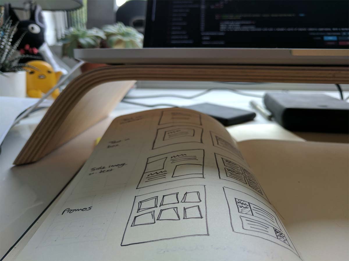
The design started with a lot of sketches. Whilst the main elements were known, the challenge came when actually attempting to flesh out the details. After what felt like an age of false starts, a breakthrough came in the form of a ‘6-up 1-up’ exercise held with a UX friend over a Hangout, which really helped to solidify the approach.
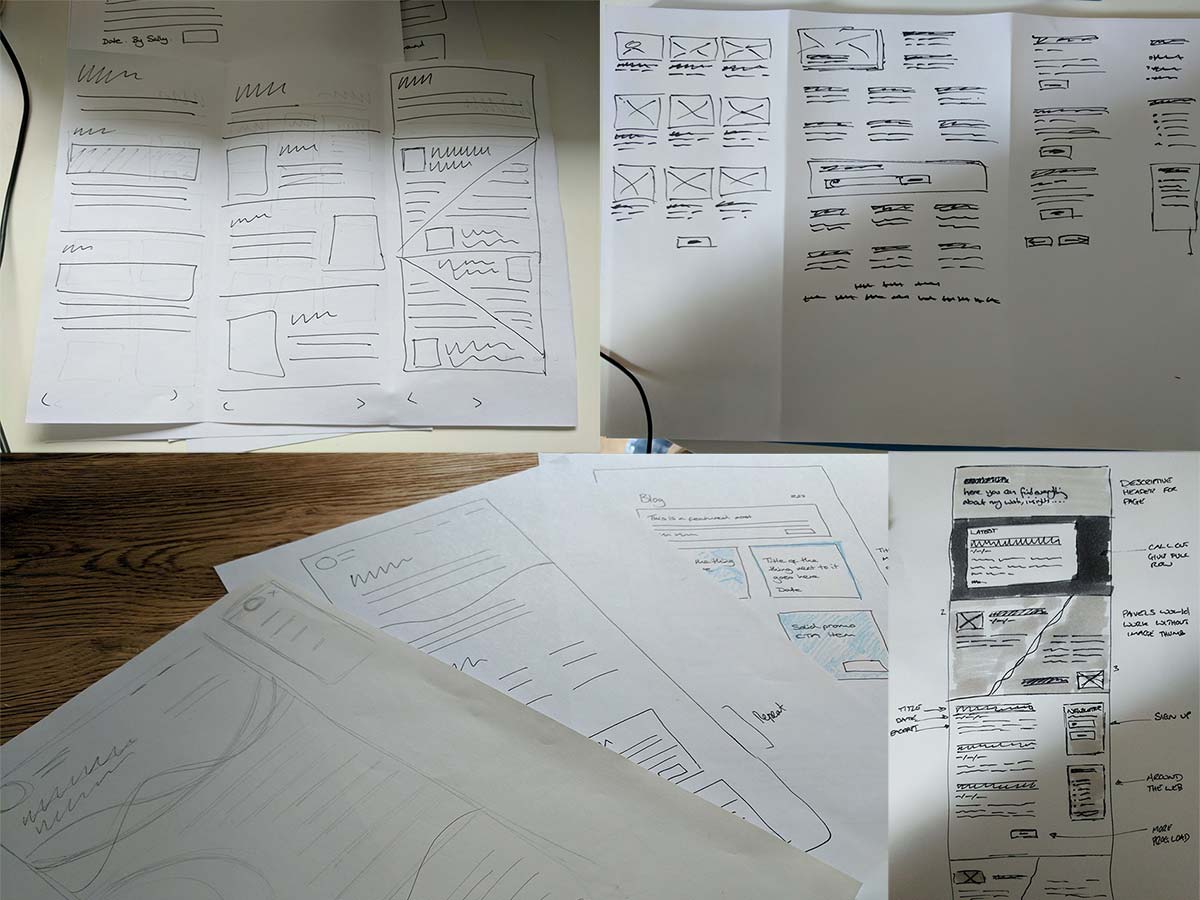
Following the call there were certain elements that I wanted to explore further, creating some prototypes of individual elements. These weren’t all used in the final site, but lent weight to the reality of design concepts, and allowed things like different imagery and text lengths to be easily checked against.
Front-end choices
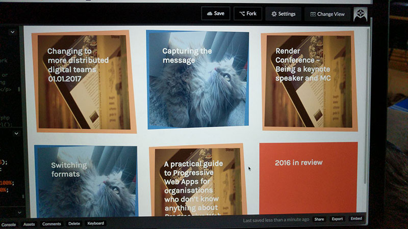
After that it was a matter of turning it into reality, and starting to create templates for different elements within Hugo.
The site uses a component-led approach, where each re-usable element was designed and coded in their own right before being combined into pages. These elements are then able to be used across different pages, leading to fewer inconsistencies, code that’s easier to test, and less duplication of efforts. Many organisations work this way now, creating front-end style guides and pattern libraries to document the components and how they can be used. If you’d like to learn more, Anna Debenham and Brad Frost’s <styleguides.io> reference is an excellent place to start.
Due to wanting a bit of a head start in terms of design assets and a structure to work within, I turned to Foundation, which is a responsive front-end framework with many basic elements pre-made. This was both a blessing and a curse, in that it got everything up and running very quickly and helped me to pin down how little aspects should look and work, but came with a lot of overhead in terms of code that wasn’t needed. It also made it incredibly tricky to debug exactly why certain things were breaking, as you have to trace through an enormous generalised package.
In general, I don’t recommend that clients use frameworks like this for their websites unless there’s a good reason to. I use Foundation for quick things like prototyping, but the bloat, loss of control, and opinionated code mean that it’s rarely best to use it in production. Many others feel differently though, and my use here shows that there are situations where it may be useful to go against your usual views. Whilst it helped me to get to an initial launch, the CSS and JavaScript behind the site are high on the list of priorities to revisit, in order to make them more performant and easier to maintain.
On top of the Foundation framework I built a number of custom elements in. The desire to feature irregularity and changing shapes led to the concept of the animated wave in the header (which respects Reduce Motion settings if available and activated, for accessibility reasons). It also led me to experiment with the CSS Clip Path property, which hasn’t yet been made available for all browsers, but is an example of a nice aesthetic enhancement that people will receive if their browsers are capable of supporting it.
Next steps
So what else aside from the CSS and JavaScript refactor? Also on the backlog (outside of some known bugs - please do let me know if you find any critical issues) are some other enhancements.
I’d like to continue the animation through to the logo, using some of the other variants that Katherine has put together. I also want to build in Progressive Web App capabilities, which would mean that amongst other things you could read this article offline. I wrote more about PWAs here if you’re interested. One of the pre-requisites for this is to serve the site over HTTPS, which I’ve wanted to do for a while. This not only helps with security, but also has other positive side effects (things like Google featuring HTTPS sites more highly in search rankings).
It’s never easy to find the time to work on your own projects – whether because of client work or because there’s always ‘not enough time’. It’s been great seeing so many of my clients starting to focus not only on their public-facing offerings but also their internal systems, processes, and tools, and I’m so pleased that I was able to take the time to join them, and start creating some new foundations for the future.
Read more from the blog
Back in time:
Changing to more distributed digital teams
Forward in time:
Transformations don't need to be about technology
Posted by Sally Lait
Sally is the lead consultant and founder of Records Sound the Same, helping people with digital transformation. She's also a speaker, coder, gamer, author, and jasmine tea fiend.