Published on Friday, 28 Jul, 2017
Designing for 10 years' time
 Sally Lait
Every now and again someone in the web community will throw out a question on Twitter that sparks some great perspectives. The latest to catch my eye was Chris Coyier's question about how to approach a situation where a client has asked for something very specific: to design something that will last 10 years.
Say you took a client and they said "design me a website that will look great with no changes in 10 years". You would ______
— Chris Coyier (@chriscoyier) July 27, 2017
It was so interesting to see people’s responses - ranging from flat out rejecting the client, accepting a challenge, laughing, or providing specific suggestions like saying to focus on minimalistic design and typography. The general consensus is that a request like this is unrealistic and as such it was treated as a bit of a joke by some.
The concept of websites over time is one that has interested me since working on a large-scale change project for a well known utilities company (where the starting premise was actually very similar), and perhaps because of this my response was slightly different to some of the other suggestions:
Ask them to show you a few examples of 10 year old websites that they feel are good examples of how they want their site to age.
— Sally Lait (@sallylait) July 27, 2017
People seemed to like this, and I wanted to expand a little bit as to why I suggested this in the first place. The intention wasn’t to trick clients with an impossible challenge that would then make them change their mind. It was to start a conversation.
To jump in with assumptions about a request like this, or to dismiss ideas out of hand is to do both ourselves and clients a disservice. Instead, there are several areas that are really good to think about, that I’d like to capture here.
Is everyone speaking the same language?
In the same way that most of my family still believe I’m a web designer (I have not, and will never be), I wonder whether the popular use of “design” as a catch-all for everything to do with making websites is coming into play here. Is it really the design and “looking great” in 10 years that they care about, or is this how they see the process of making websites - that the visuals are the only important element, created by a “web designer”?
Is the client actually asking for something to be created which will have absolutely nothing done to it in terms of design and technology, or is this their way of saying “my budget is really tight and I’m concerned you’re going to be charging me more every year, so we need to minimise any work"?
By asking for examples, we can make sure that what they think they’re asking for matches with how we receive and process that request.
What constitutes ‘look great’?
When we work within the web industry and see beautiful examples of design every day it’s easy to forget that others don’t always judge with the same eyes as we do. Looking great isn’t just about the latest design trends. By asking someone to provide examples of what they mean, both parties can have a conversation built on a communication aid rather than words, again helping to give a shared understanding.
What makes something look great? Is it just simplicity? White space? Colours? Fonts? Or is it actually the content and imagery, or even the information architecture and structure that makes the person think it’s looking great. By referring to examples, it gives us the opportunity to better collect specific direction and requirements.
This shouldn’t be seen as a test - I had one Twitter response suggesting that the client may come back with “Well I’m not a designer, how would I know?". The aim isn’t to judge the person on their selection of example sites, but to understand why they’ve asked for what they have, and what this request is built on.
For instance, a person may cite Wikipedia.org as an example of something that still looks great after 10 years. Why do they think this?
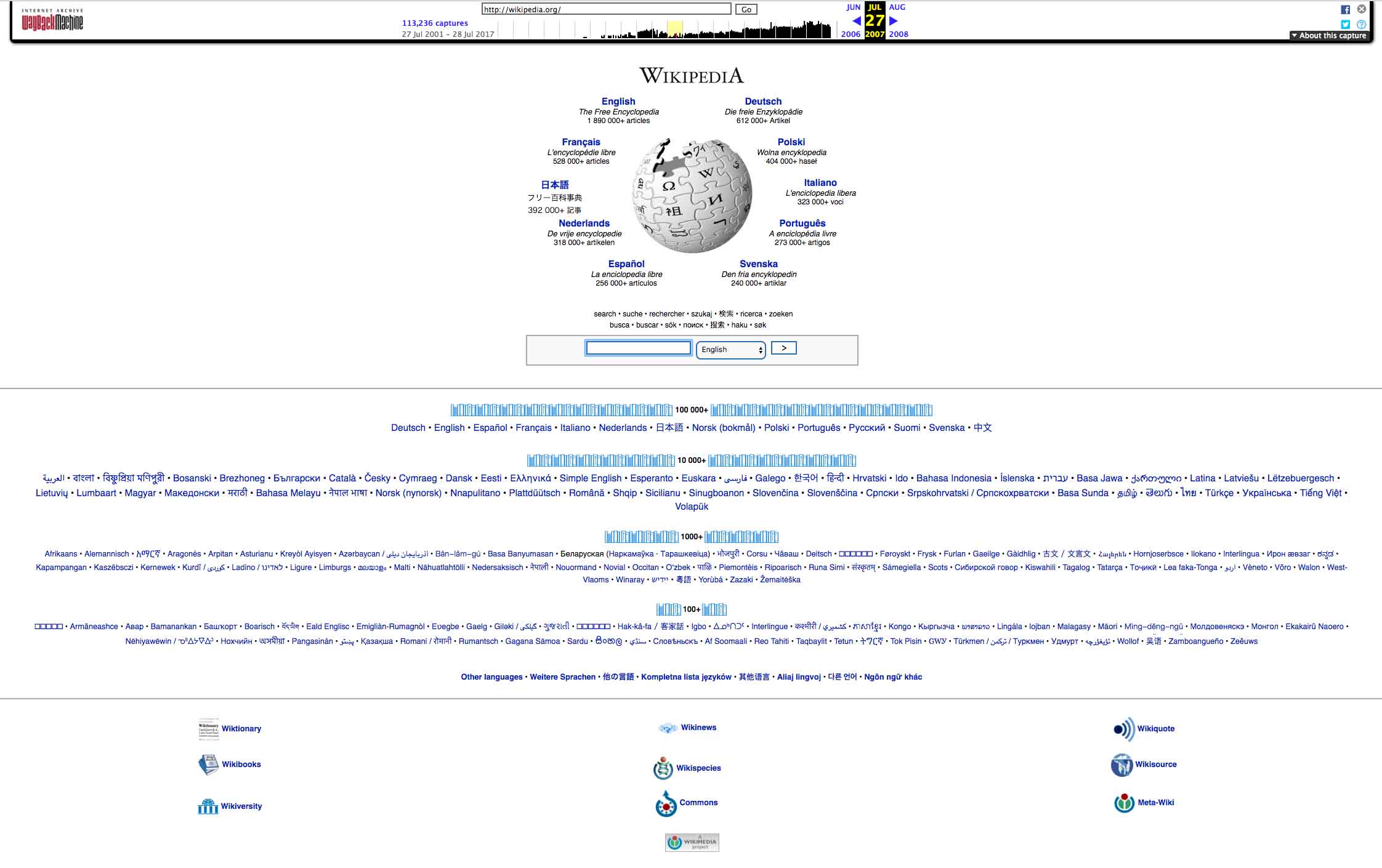
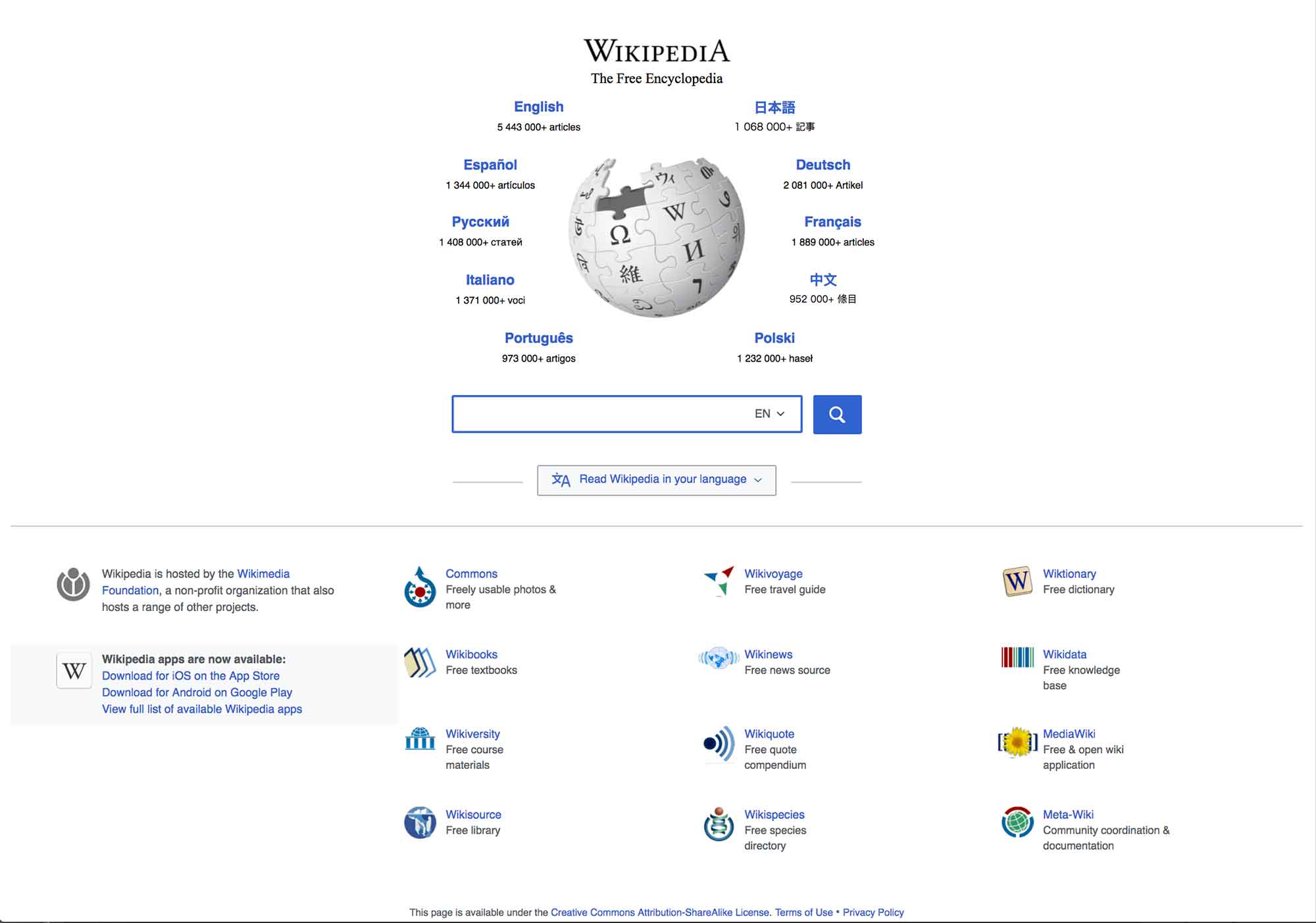
Helping people to understand the processes
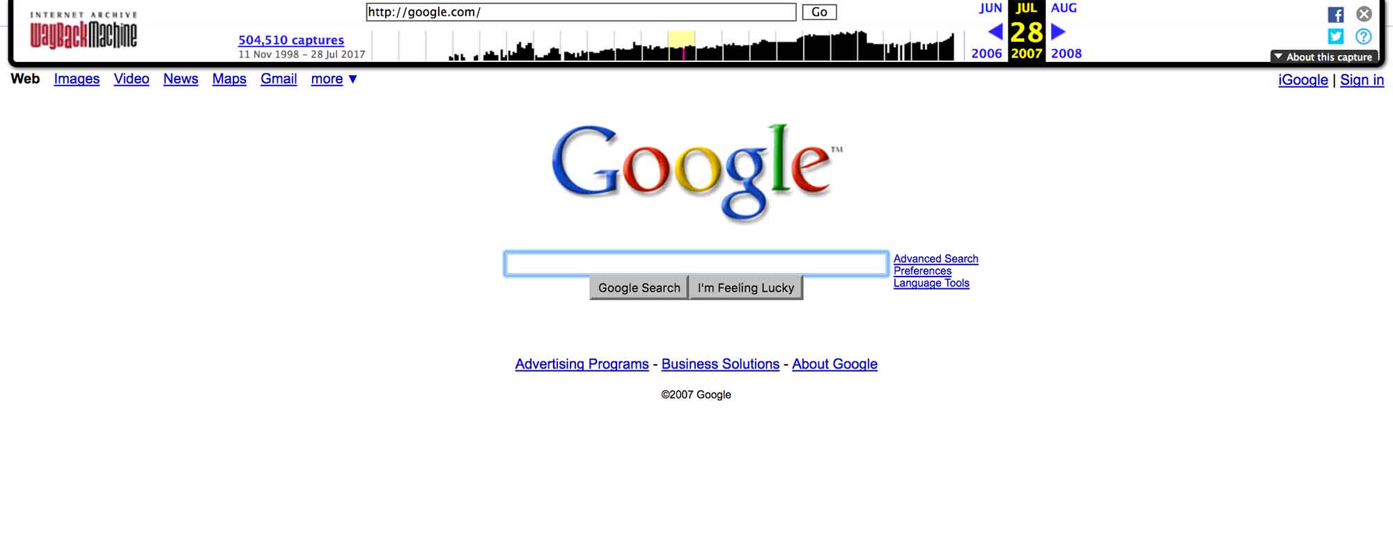
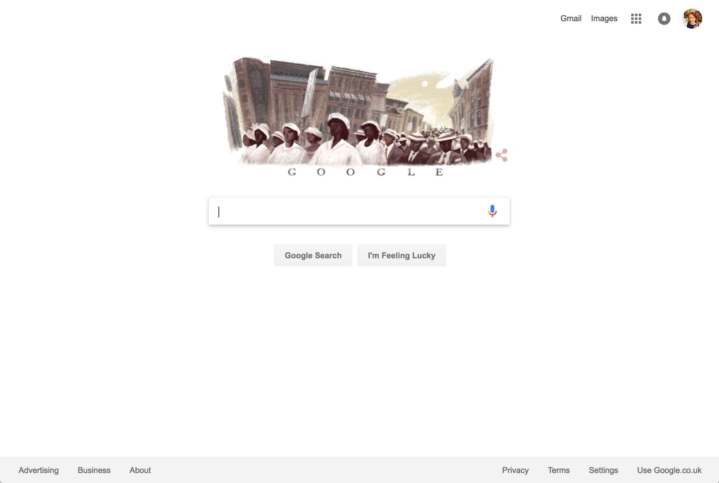
Google is another example of a website that’s been around for over 10 years. To most people it hasn’t really changed, and if you were to ask someone to draw a sketch of Google 10 years ago vs now they’d likely draw exactly the same layout. However, ask a designer or developer and they’re likely to mention the introduction of material design principles, the expansion of Google products and services, personalisation, and even the Google Doodles, one of which happens to be featured today. You can probably spot other subtle differences between the images below.
By asking for examples of reference sites we can start to discuss all of these other factors, what they offer, and what the impact is. Does our requirement for a website to be unchanging mean a solid core vision and product offering around which other visual aspects can ebb and flow, like Google? Is it that they’re actually asking for the foundations, the systems, the ability for themselves to make changes rather than having to go back to the original creator or agency? Can we start to talk about concepts like pattern libraries and style guides, content management systems, or decoupling our interfaces from the systems that power them?
References can help us to see whether everyone’s perception of unchanging matches up, and to build understanding about the ongoing evolution of websites.
Ask them about specific scenarios
Whenever a situation comes up that people in the web industry take for granted, I try not to forget that not everyone spends their days thinking about the same things that we do. They have their own jobs to worry about!
Through years of experience we know the kind of questions that give us the information we need to design and build websites, and it should be our responsibility to pose these. The client may not have thought about many things that we take for granted, so by using specific scenarios or posing questions we can dig a bit deeper whilst grounding our investigation in a context that the person can picture.
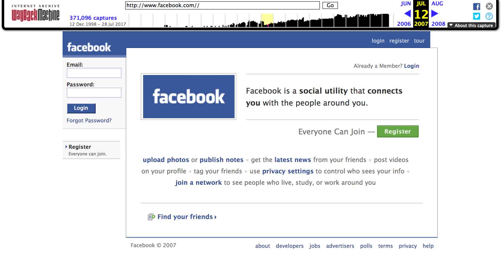
“Facebook has been around for over 10 years. In that time they’ve decided to change the look and availability of their site to work across all sorts of phones and other devices that didn’t exist when they first launched. How do you see your site adapting to being used in the flying cars or retinal internet implants of 10 years time?"
Perhaps they’ll say it should stay the same, in which case you can follow up by asking what they think of non-responsive websites in the present day (they may not be bothered by this, or they may not have considered it - both of which are good to know). Perhaps they’ll expect it to adapt automatically, in which case we can talk about options to change over time, and explain what’s needed for this to happen. Perhaps it’ll turn out that they’re ok with making changes in these situations, and that wasn’t what they meant.
“Facebook has also added in lots of features over the last 10 years - things like being able to take photos directly and upload them, or tell people your location. What kind of functionality can you imagine might be possible over the next 10 years that people might want?"
The discussion here is very much about thinking about how best to future-proof, but also discussing the concept of their audience’s expectations and interaction habits changing over time - again something that we’re well versed in but which the client may not be thinking about.
Using the future is a great tool in these situations. It’s funny and silly to talk about flying cars, holo-terminals, or lives lived entirely in VR, but people can easily project their hopes and fears onto fictional, futuristic scenarios and we can relate this back to needs in the now.
The half-life of different aspects of a website
I believe that it’s possible (and desirable) to set out with a goal of creating things that live on for the next 10 years and more. They key is to understand what expectations are, explain possibilities, and to design and build with the future in mind.
In one of my talks from last year I spoke about the lifespan of different elements of our websites. Within chemistry, the half-life of a substance is the time it takes for half of the substance to decay, and this can vary hugely. We can see the same when it comes to the design and technology involved in websites.
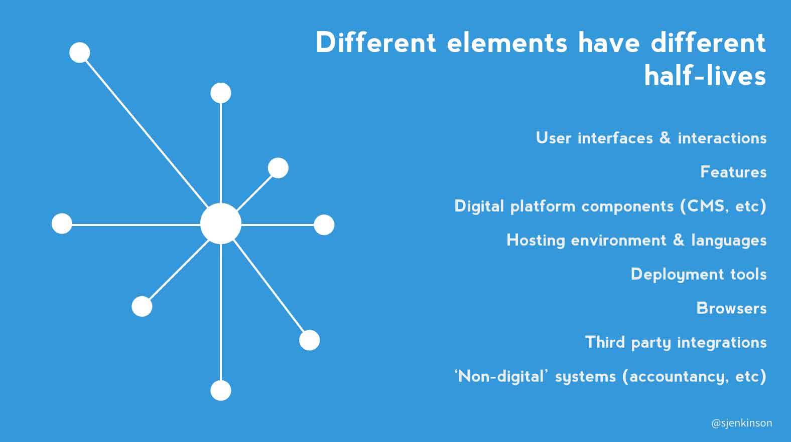
In the context of the web, a shorter half-life may mean more regular assessment and updating, and a longer lifespan being elements that play more into your larger strategic thoughts. Our content may be updated daily. Things like browser capabilities and user expectations for interactions change relatively rapidly, and we may want to adapt to keep up with demand. However when it comes to things like our accountancy systems or underlying infrastructure then we’ll likely (hopefully) not be updating this every year.
By using other long-standing sites as reference points to query the above points, and by discussing the concept of half-life in relation to the different elements of a site, we can hopefully meet our client’s original need and build something better and more sustainable than we may have done otherwise.
Read more from the blog
Back in time:
What digital transformation means for us
Forward in time:
Net magazine essay: Thinking beyond websites
Posted by Sally Lait
Sally is the lead consultant and founder of Records Sound the Same, helping people with digital transformation. She's also a speaker, coder, gamer, author, and jasmine tea fiend.